Revision notes, worked examples and methods for scatter graphs and correlation.
Notes and quizzes ready · 50 questions · Revision video ready.
Foundation shows shared notes and questions. Higher includes the shared content and labelled Higher extensions. Changing tier starts the notes and a new quiz set.
Revise the key ideas
Scatter graphs and correlation
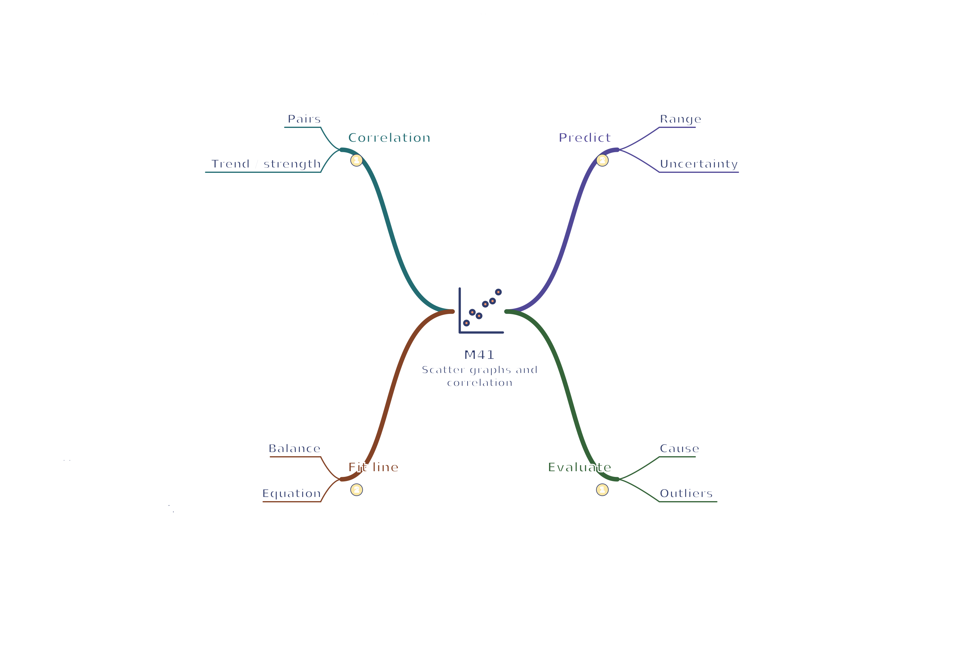
A scatter graph displays pairs of numerical measurements for the same items. Plot one variable on each axis and do not join points in time order. Positive correlation and an estimated best-fit line
Positive correlation means larger x values tend to accompany larger y values; negative correlation means larger x values tend to accompany smaller y values. No correlation means no clear relationship in the scatter.
Strength describes how closely points follow a pattern, not the steepness of a trend line. A shallow but tightly clustered trend can be strong correlation.
Correlation does not establish causation. A third factor, coincidence or the way a sample was selected could explain an association.
An outlier is far from the general pattern. Investigate recording errors or unusual circumstances rather than automatically deleting it.
Lines of best fit and predictions
For an approximately linear relationship, draw a line of best fit through the middle of the scatter, with roughly balanced points above and below. It need not pass through the origin or through two selected data points.
Choose two well-separated points on your best-fit line to estimate its gradient and equation. They need not be original plotted observations.
Worked example: A best-fit line passes through (2, 5) and (8, 17). Gradient = 17 − 58 − 2 = 2, so its equation is y ≈ 2x + 1. At x = 5 it predicts y ≈ 11.
Interpolation predicts within the observed x range and is usually more reliable. Extrapolation predicts outside that range, where the relationship may not continue.
Predictions are estimates; scatter shows individuals may differ from the line. Do not report unjustified precision from a loosely scattered graph.
For a clear curved pattern, a straight line is an inappropriate model. Describe the relationship and use a suitable smooth curve if the task calls for one.
Interpreting claims
If study time and test scores are correlated, that alone does not prove an extra hour causes a fixed score increase. Prior knowledge, teaching and motivation may also matter.
A large outlier can affect a fitted line strongly, especially with a small sample. Explain how the line's reliability might change if the observation is erroneous or exceptional.
State the sample range, units and evidence behind a prediction. For example, predicting at 6 hours from observations between 1 and 8 hours is interpolation; predicting at 15 hours is extrapolation.
Test yourself
50 questions · Sets of 10 from the selected tier. For fractions, use / when typing; for powers, use superscripts or ^. Follow each question's answer format. These quick checks support revision; practise full written solutions and proofs too.
Watch M41 · Scatter graphs and correlation
Revise scatter graphs and correlation with this narrated video. Use the player controls to pause, seek, adjust the volume or mute. Turn English captions on or off using the captions menu.
 Mr Kidman's Classroom