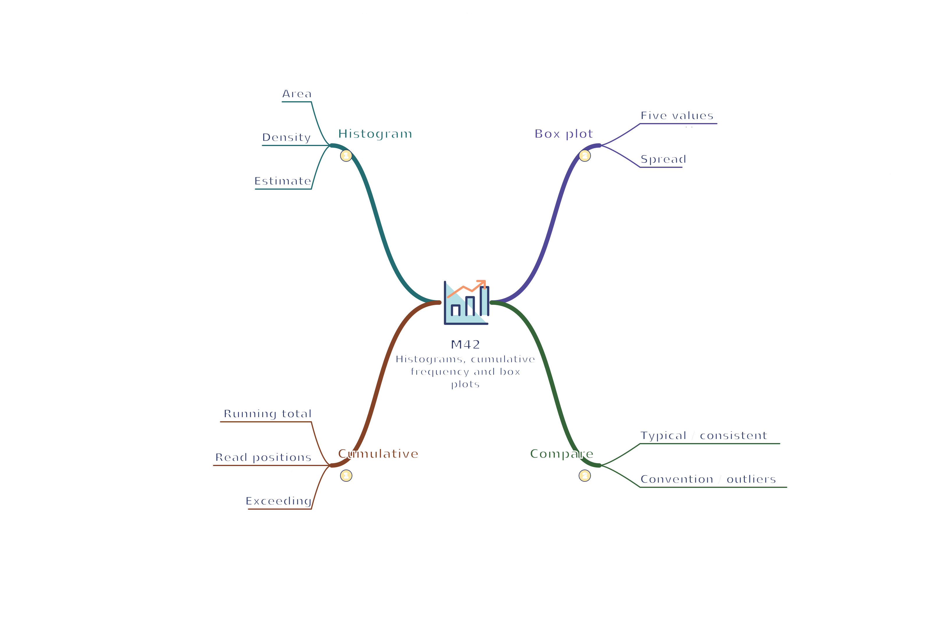
Revision notes, worked examples and methods for histograms, cumulative frequency and box plots.
Notes and quizzes ready · 50 questions · Revision video ready.
This topic is Higher-only.
Revise the key ideas
Higher — histograms
A histogram represents continuous grouped data. Bars meet at class boundaries; their widths correspond to class widths. For unequal classes, area, not height, represents frequency.
Frequency density = frequencyclass width. Therefore frequency = bar width × frequency density. Label the vertical axis “Frequency density”. Unequal-width histogram classes
Worked example: Class 0–10 with frequency 8 has density 0.8. Class 10–30 with frequency 12 has density 0.6. The second bar is shorter but has greater area and more observations.
Read class boundaries carefully; a class from 10 to 30 has width 20, not 21. Use the continuous measurement convention given in the question.
For a partly filled class, estimating frequency from part of its area assumes values are distributed uniformly within that class. State that it is an estimate.
Higher — cumulative frequency
Cumulative frequency is the running total up to each class boundary. Plot cumulative counts against upper class boundaries, usually starting at the lowest boundary with cumulative count 0. Reading a median from cumulative frequency
A cumulative frequency curve never decreases. The final cumulative count equals the total sample size; use the class boundaries rather than midpoints on the horizontal axis.
For a graph with n observations, read an estimated median at cumulative frequency n2, lower quartile at n4 and upper quartile at 3n4. These graph estimates can differ from exact ordered-data conventions.
Worked example: With 40 observations, read Q₁ at cumulative count 10, median at 20 and Q₃ at 30. Go horizontally to the curve, then vertically down to the measurement axis.
To estimate how many values exceed a measurement, subtract the cumulative count at that measurement from the total. Keep uncertainty from graph reading and within-class distribution in mind.
Higher — box plots and comparing distributions
Interquartile range (IQR) = Q₃ − Q₁. It describes the spread of the middle 50% and is less affected by extreme values than the range.
A standard GCSE box plot marks minimum, lower quartile, median, upper quartile and maximum on a common scale. The box extends from Q₁ to Q₃, with a median line inside. Box plot from a five-number summary
Worked example: Minimum 4, Q₁ = 10, median 16, Q₃ = 22 and maximum 35 give IQR = 12 and range = 31. The box width does not show sample size.
Compare medians for typical values and IQRs for consistency. A group with smaller IQR has less variation in its middle half, which is not necessarily the same as smaller overall range.
For exact ungrouped data, order the observations and follow the stated quartile convention; small datasets can use different conventions. For grouped continuous data, quartiles read from a curve are estimates.
If a task supplies an outlier rule, apply it precisely. The often-used limits Q₁ − 1.5 IQR and Q₃ + 1.5 IQR flag unusual values, but do not by themselves prove those values are errors.
Test yourself
50 questions · Sets of 10 from the selected tier. For fractions, use / when typing; for powers, use superscripts or ^. Follow each question's answer format. These quick checks support revision; practise full written solutions and proofs too.
Watch M42 · Histograms, cumulative frequency and box plots
Revise histograms, cumulative frequency and box plots with this narrated video. Use the player controls to pause, seek, adjust the volume or mute. Turn English captions on or off using the captions menu.
 Mr Kidman's Classroom