Explain the methods, show your working and interpret results in context.
Foundation shows shared notes and questions. Higher includes the labelled extensions. Maps and checklist downloads include labelled Higher content; the worksheet generator filters individual goals.
Revise the key ideas
Tables and familiar charts
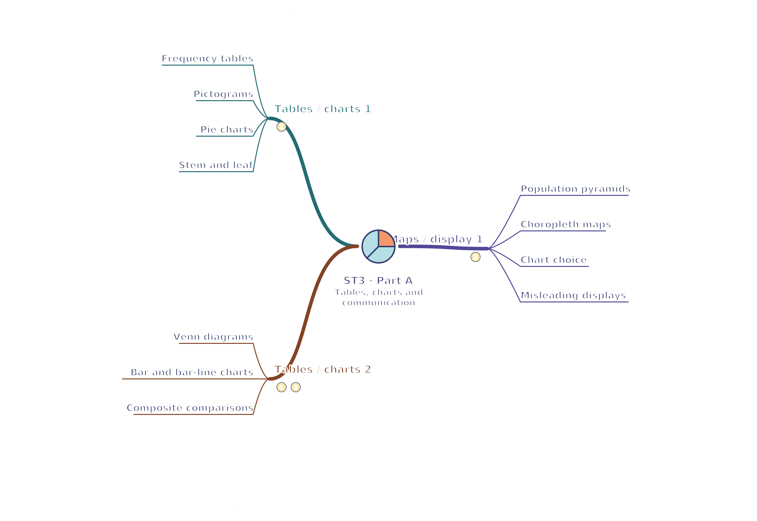
Frequency tables — A tally records each occurrence and a frequency is its count. Check the sum against the sample size. Relative frequency divides a count by the total; proportions sum to 1 when categories are exhaustive and exclusive. A two-way table crosses two classifications and needs consistent row, column and grand totals.
Pictograms — State a key for the value represented by one symbol. If one symbol means four customers, half a symbol means two. Use identical symbol size and sensible fractions rather than enlarging one icon to suggest a greater frequency.
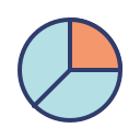
Pie charts — For exclusive categories covering the whole, sector angle = frequency / total × 360°. A category of 15 out of 60 has angle 90°. Compare proportions on equal-size charts; their sector angles do not by themselves show differences in total populations.A quarter of a pie represents 15 of 60. Original illustrative diagram; numerical datasets are fictional worked examples.Enlarge diagram
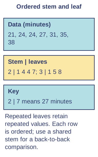
Stem and leaf — Split values into stems and leaves, order leaves within stems and give a key, such as 2 | 7 means 27 minutes. Repeated leaves retain repeated observations. Back-to-back displays compare two groups with a shared stem and keys; exact values remain readable.
Venn diagrams — A rectangle represents the universal set, circles represent categories and overlaps represent items in both. Put each count in exactly one region, including outside the circles. The total for A includes its overlap with B; do not count that overlap twice in A or B.
Bar and bar-line charts — Bars compare categorical frequencies with equal bar widths and separated categories; bar-line charts use narrow vertical lines for discrete numerical values. Label categories or values, frequency, units and scale. Join ordered time observations only when the connection has a meaningful interpretation.
Composite comparisons — Multiple bars compare groups beside one another; composite bars stack category frequencies. Percentage composite bars each total 100%, comparing composition while hiding different totals. Choose a legend and consistent order, and state the original totals when absolute size matters.
Maps, audiences and fair displays
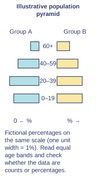
Population pyramids — A pyramid uses age bands vertically and two population groups on opposite sides, often sexes. Check whether bars show counts or percentages and whether the horizontal scale is symmetric. Compare widths for the same age band; different population totals affect count comparisons.
Choropleth maps — Shading shows a value for each region using a legend with defined intervals. Rates or proportions often make comparisons fairer than raw totals when region populations differ. A large shaded area is not necessarily a large population; boundaries can hide local variation.
Chart choice — Use a pie chart for composition, bars for categories, a scatter diagram for paired measurements and a histogram for grouped continuous values. Consider the audience and purpose. A spreadsheet's suggested chart is only a starting point; check whether it preserves the meaning of the data.
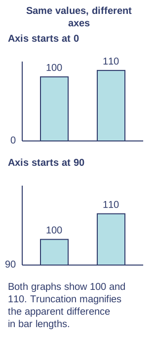
Misleading displays — A truncated bar-chart axis can exaggerate differences because bar length encodes frequency; label any break clearly. Unequal scale intervals, omitted categories, disproportionate pictures and 3D perspective distort comparisons. Check numbers and denominators rather than judging visual impact alone.
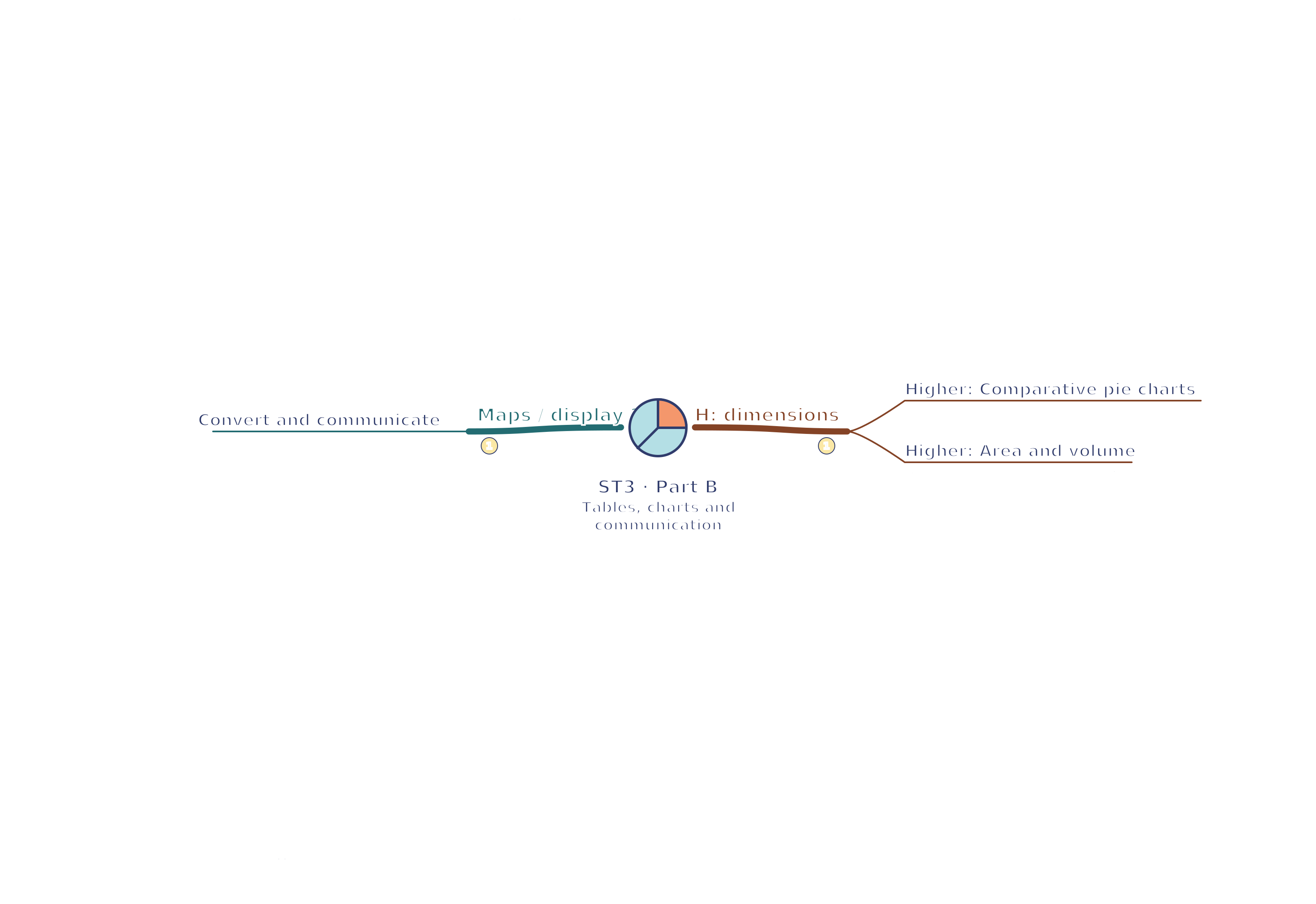
Convert and communicate — Translate between counts, percentages and displays using the same total. State source, date, population, sample size and units beside the result. A 25% slice in a sample of 80 means 20 observations; percentages from different totals require separate count calculations.
Higher — comparative dimensions
Comparative pie charts — To show totals as well as proportions, make whole circle areas proportional to totals. Since area = πr², a population four times as large needs twice the radius, not four times. Then sector proportions within each circle show its composition.
Area and volume — For geometrically similar 2D pictures, frequency ratio equals the square of the linear scale factor; for similar 3D objects it equals the cube. A doubled height and width gives four times the area. Perspective and decorative pictures can obscure the intended scale, so include values and a clear key.
Test yourself
30 questions · Sets of 10 from the selected tier. For fractions, use / when typing; for powers, use superscripts or ^. Follow each question's answer format. These quick checks support revision; practise full written solutions, graph constructions and enquiries too.
Mind map
Use the branches to recall the ideas and explain their connections. Check the revision notes for the full detail.
View ST3 · Tables / charts 1 / Tables / charts 2 / Maps / display 1 mind mapOpen the full-size map to zoom. Download the PDF to print on A4 or enlarge to A3.
 Mr Kidman's Classroom